Research/A Hundred Years of Wind/Ⅳ Technique & Medium
Ⅳ Technique & Medium · 44 / 100
The Depths of Near-Monochrome
Looking Longer at Differences within Reduced Colour
단색조의 심연
Colour That Appears to Be One
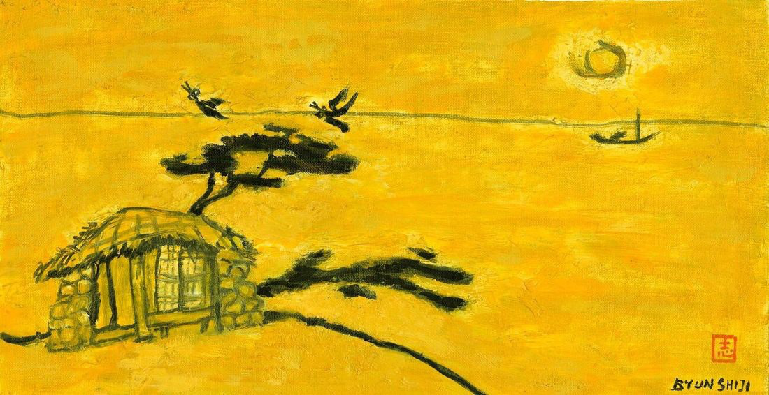
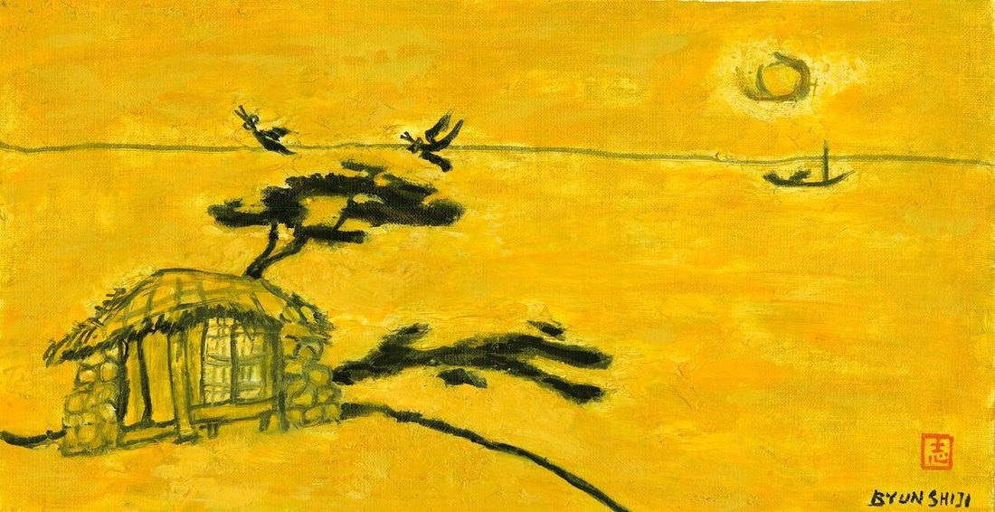
From a distance, Empty House (1987) first presents a broad yellowish field. Closer up, the house wall, the area around the tree and the lightness of the sky are not identical. Nor do the dark forms carry a single weight. Near-monochrome names the dominance of related colours here more accurately than a claim that only one colour exists.
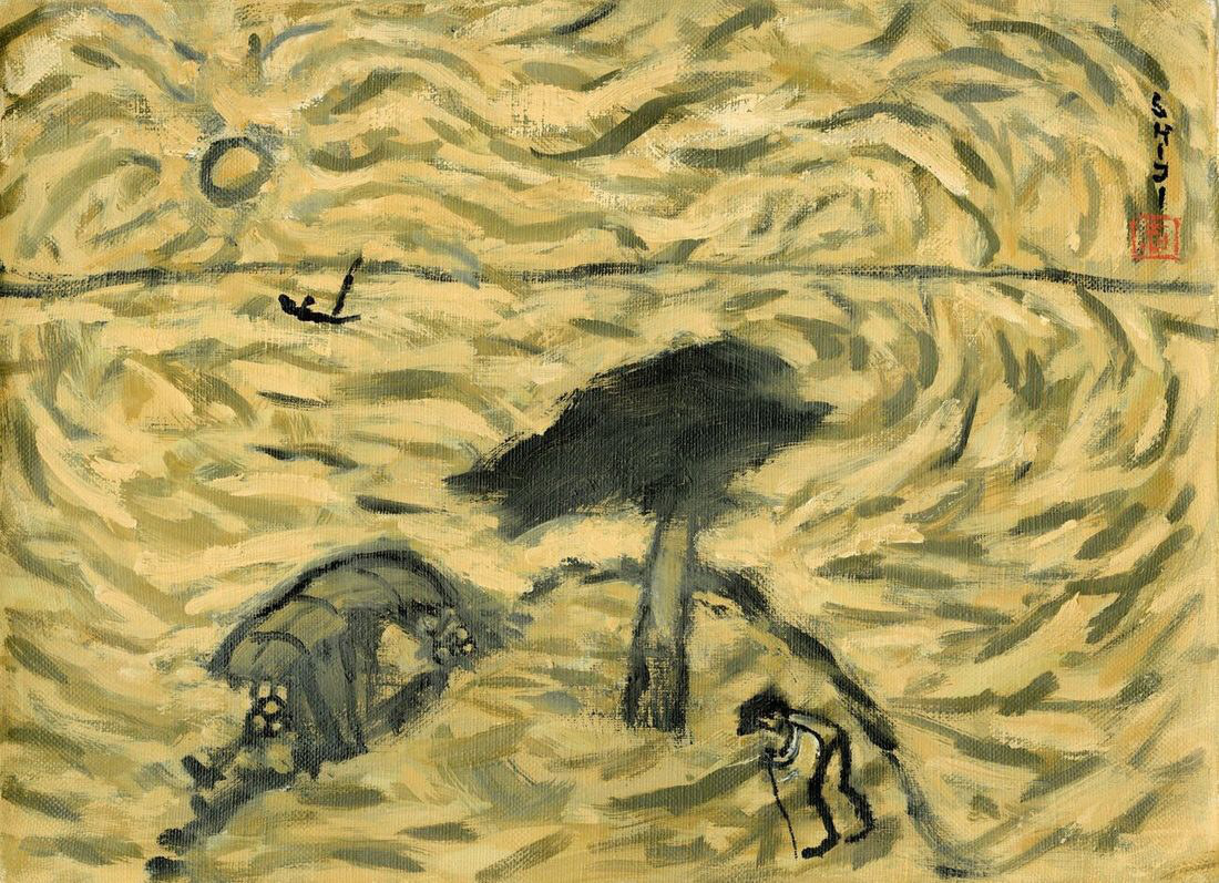
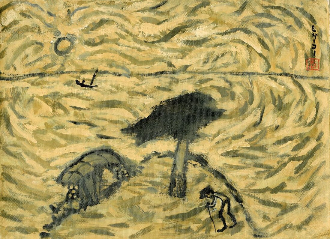
Noon (2007) may also seem to inhabit a restricted colour world. Yet small curved strokes fill much of its surface, with light ground and darker areas closely interlocking. Its density differs from the broad intervals in Empty House. Even under the same description, near-monochrome, the manner in which attention stays with the work changes.
Beginning with this difference prevents us from moving directly from reduced colour to a tranquil mind. A restricted palette can make a busy surface, just as many colours can make an ordered one. Colour count measures neither emotional depth nor artistic maturity. We need to ask separately what has been reduced and what has become more sensitive.
Two Paintings with Different Rhythms
In Empty House, house and tree gather towards the left, while a broad ground opens to the right. The small boat and sun do not fill that opening. Moving from near forms towards the distance, the eye encounters an interval that takes time to cross. The continuity of the ground’s colour contributes to this sense of distance.
In Noon, curved strokes subdivide that distance repeatedly. They continue between the tree’s dark upper mass, the house’s outline and the figure below. Rather than travelling outward in one movement, attention shifts between adjacent light and dark areas. A related tonal range can open space in one painting and articulate it into a textured field in another.
The designation late work should not predetermine a movement towards emptiness. Dense activity remains in this painting from 2007. Reduction, quietening and ageing can be related, but they are not the same event. Setting the two pictures beside each other reveals more variation than a story of steady movement towards one emotion allows.
Reduction Also Redistributes the Work
When objects are not assigned different colours, the work of distinguishing them passes to other elements. The house is read through the curve of its roof and short wall lines; the boat’s distance through scale and placement. Reducing colour need not abolish distinctions. It can change which elements are entrusted with making them.
A slightly thicker line or a lighter patch of ground may then become more consequential, because small differences emerge among related tones. The effect is not automatic. Too little difference may obscure a form; too much may divide a ground that had held together. Restraint requires adjustment.
Condensation is useful when it names this specific adjustment. It does not mean that every colour has physically entered a single pigment. Fewer differences are asked to perform several roles without undoing one another. Rather than declaring invisible depth, condensation becomes a question that helps us find more relationships in the picture.
Beside Reinhardt’s Black
The Smithsonian American Art Museum’s account of Ad Reinhardt’s Abstract Painting no. 4 (1961) draws attention to subtle blue and plum divisions within a surface that initially appears black. Time spent looking participates in discerning its differences. The example unsettles any division that treats Western monochrome as invariably conceptual and detached from material sensation.
There is no need to make Byun Shi-Ji and Reinhardt equivalent. They can share a question about colour that seems singular at first and differentiates with longer attention. In Byun Shi-Ji, those differences also connect to recognising houses, boats, people and trees. Discerning tonal variation and reading distance within a landscape overlap.
The comparison does not determine which painter is deeper. It asks what arrests attention and what becomes visible later. The works need not be keys that explain one another; they can stand beside each other to make their differences clearer. Related problems can receive different formal answers.
Not Reducing Dansaekhwa to an Inward State
MMCA’s exhibition account of Yun Hyong-keun considers blue and umber, heaven and earth, alongside the artist’s life and historical experience. It does not explain a dark-looking canvas solely as inward meditation. This example makes it difficult to maintain a simple opposition between Dansaekhwa as spiritual practice and Byun Shi-Ji as a response to fūdo.
Practice and fūdo, repetition and memory are not mutually exclusive categories. Place and history can enter a repeating hand, while painting a place may require sustained repetition. Differences should be sought in how action, surface, form and space combine in particular works, rather than in labels dividing them into two camps.
What remains clear in reading Byun Shi-Ji’s near-monochrome is the continued presence of recognisable forms. Houses, bodies and horizons make relationships within a chromatic field. This alone does not establish his position inside or outside a movement, but it supplies a concrete basis for comparison. Art-historical classification and observation of a particular painting should assist each other.
Shared Colour Does Not Guarantee Equality
Related colours may connect people, animals, houses and ground without removing every difference. In Noon, the tree’s large dark mass claims attention more strongly than the small figure. The near house and distant boat in Empty House also retain different scales. The paintings gather colour while continuing to use differences of size and position.
Visual difference is not automatically a difference of value. Larger does not mean more worthy, nor smaller less important. The converse also matters: being painted in related colours does not prove ethical equality. Reading equality in a painting requires attention to relations among bodies as well as to colour.
Calling near-monochrome the only condition of equality would exclude the possibility that richly coloured paintings can make a shared world. Byun Shi-Ji’s blue early Jeju works should not be excluded in that way either. No single technique has a monopoly on ethical meaning. The question is which relations reduced colour makes more available in this work.
Keeping a Distance before Reproduced Colour
What we are looking at here is a reproduction. Colour transmitted through photography, printing and a display does not carry every difference of the physical painting unchanged. Relative lightness and the placement of darker forms can be examined, but subtle chromatic differences, gloss and paint layers have not been fully established. The finer the distinction claimed, the more these conditions matter.
This is another reason not to fix dried-grass colour to a single digital value. The painter himself says that his yellowish tone varies from one work to another. Normalising those differences into one standard colour would erase changes an archive ought to show. Preserving colour is closer to retaining differences between works than to repeating a representative swatch.
Depth here does not mean a secret substance concealed beneath the surface. It names the experience of relationships becoming perceptible over time: the thickness of a near line, the scale of a distant boat, an interval of light ground. Depth may arise not from adding something new, but from belatedly seeing differences already present.
The Eye Continues to Move within Colour
It is inadequate to say that the eye has nowhere to go before near-monochrome. The small curves in Noon send attention in several directions. The broad ground in Empty House also opens routes from house to boat and from tree to sun. Fewer colours do not confine the eye to a single path.
Byun Shi-Ji’s reduced colour can be read as a choice to make us look differently, rather than see less. Attention shifts from colours named for separate objects towards lightness, direction and intervals across the picture. Yet objects do not disappear. Returning from colour, we still find a house and the person’s small body.
Close up, there are light intervals. A step back, and the house becomes visible among them again. The boat remains far away.